How to combine floors and wallpaper.
There is an order to decide in
The floor is decided. Next, the walls.
This is where many people stop in front of endless wallpapers.
But if you follow the order of choosing, the candidates narrow down to a few.
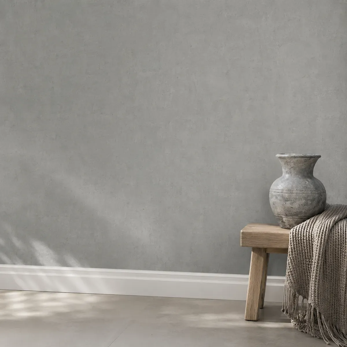
Walls and floors are not chosen separately. Look at them as one connected surface.
Decide the floor and wallpaper in this order: (1) brightness, (2) material feel, (3) strength of pattern.
First set the brightness of the whole space, then match the texture of the materials, and last choose the pattern by deciding which one will be the lead. Thinking in this order means fewer moments of hesitation and almost no failures. If you start from color or pattern, it does not come together.
First, decide the brightness.
Rather than choosing the floor and wallpaper separately, first decide whether you want the room to feel bright and wide, or calm and grounded. If this is not settled before you choose each one, they will clash later.
A light floor and light walls reflect light and open up the room. A dark floor gives the space an outline and a center of gravity, and makes furniture stand out. Neither is right; it depends on what you want to do in that room.
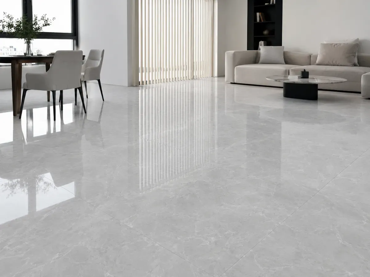
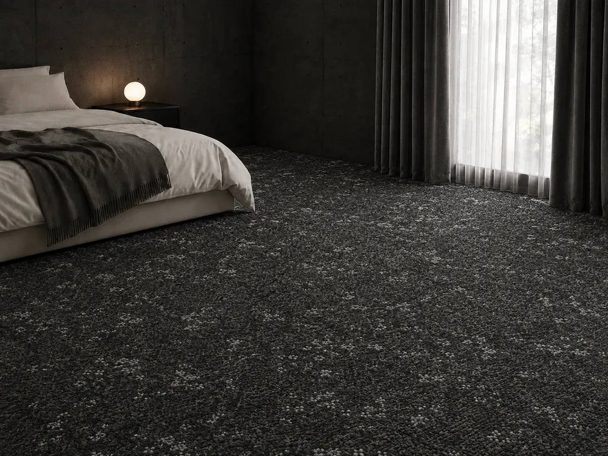
Even within one color family, leave a difference in lightness
Keeping to white, or keeping to gray, is not an easy way to fail in itself, but the floor and walls do not need to be exactly the same color. A slightly darker floor and slightly lighter walls are enough to give the room stability and openness at once.
Conversely, when the floor is lighter than the walls, the floor tends to float and feel unsettled. “Dark below, light above” is the same structure as an outdoor landscape. People are used to that arrangement.
This one line makes most combinations work.
Next, match the material feel.
Once the brightness is set, move on to texture. Even the same gray gives a completely different impression as stone, wood grain or a woven look. Even when the colors match, if the material feel is mismatched, the room feels vaguely uneasy.
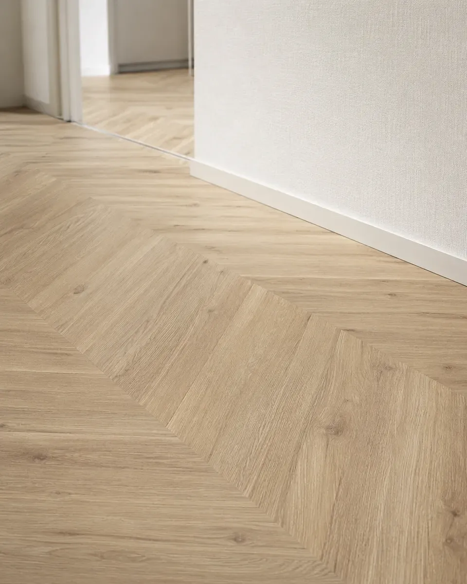
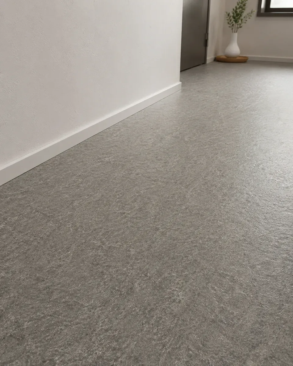
Shift the material between floor and walls
If the floor is wood grain, make the walls a plaster-look or a woven-look wallcovering. If the floor is stone, make the walls a soft texture. Using the same material feel on both either becomes monotonous or the statements overlap and feel heavy.
The standard here is the furniture you plan to put in. If you have a lot of wooden furniture, lean the floor toward stone; if you have a lot of metal and glass, lean it toward wood grain. When hard and soft materials are about half and half across the room, it is balanced.
Last, choose one lead.
Using a strong pattern on both floor and walls suddenly raises the amount of information in the room. When too many elements catch the eye, people cannot relax. So narrow the lead to one.
If you choose an expressive floor (a clear wood grain or a large stone pattern), keep the walls quiet. If you want an accent wallpaper on one wall, keep the floor close to plain. This one rule keeps the room from falling apart.
The larger the area, the lighter a floor looks, and the stronger a wall color feels. If you can, place floor and wallpaper samples side by side and compare them in both the natural light of the actual room and evening lighting.
If you use an accent wall, only one wall
Changing the color or pattern of just one wall adds depth to a room. Choose a wall without a window, or the one behind a bed or sofa. It works best where the eye naturally goes. If you change all four walls, you simply get a dark room.
Choose by how the room is used.
| Room | What you do there | How to think about floor and wallpaper |
|---|---|---|
| Living room | People gather. You spend long hours. | Do not make the difference in lightness too large. Mid-range tones that are not tiring over long hours are the safe choice. |
| Bedroom | Sleep. Lower the light. | Calm tones with little reflection. It also suits floor materials that absorb sound, such as carpet. |
| Study or workroom | Focus. Look at a screen. | Reduce the information in the background. A strongly patterned wallpaper distracts when it is in view. |
| Washroom and wet areas | Use water. Come and go briefly. | A small space, so use a light color to make it feel larger. For the floor, put water resistance first. |
| Rooms with pets | Running, sleeping, making a mess. | Beyond looks, consider slip resistance and ease of care. Also think about how coat color relates to floor color. |
* It is not unusual to use a different floor material in each room. Different uses call for different best floors.
Common mistakes and how to avoid them.
1 | Being fooled by the size of the sample
A palm-sized sample and a surface covering the whole room look different in color. The larger the area, the lighter a floor looks, and the darker a wall color feels. Use the largest sample you can, and look at it laid on the floor and leaned against the wall.
2 | Checking only in daytime
A gray chosen in natural light looks beige under warm evening bulbs. This happens often. If you spend most of your time in that room at night, use how it looks at night as your standard.
3 | Leaving furniture for later
Floors and walls are the background for furniture. If you choose only the background without deciding the color and material of the furniture you already have and will buy, the furniture will look out of place later. Bring photos of your current sofa and table to the selection.
4 | Overlooking baseboards and doors
There is a baseboard where the floor meets the wall, and a room has doors and window frames. These often stay as they are, and are usually white or wood grain. Whether the new floor and walls clash with these existing colors is a surprisingly easy point to miss.
FAQ.
Which should I decide first, the floor or the wallpaper?
Should the floor and wallpaper be the same color?
How should I combine them to make a room look larger?
What should I watch for when deciding from samples?
Can I change the wallpaper in a rental too?
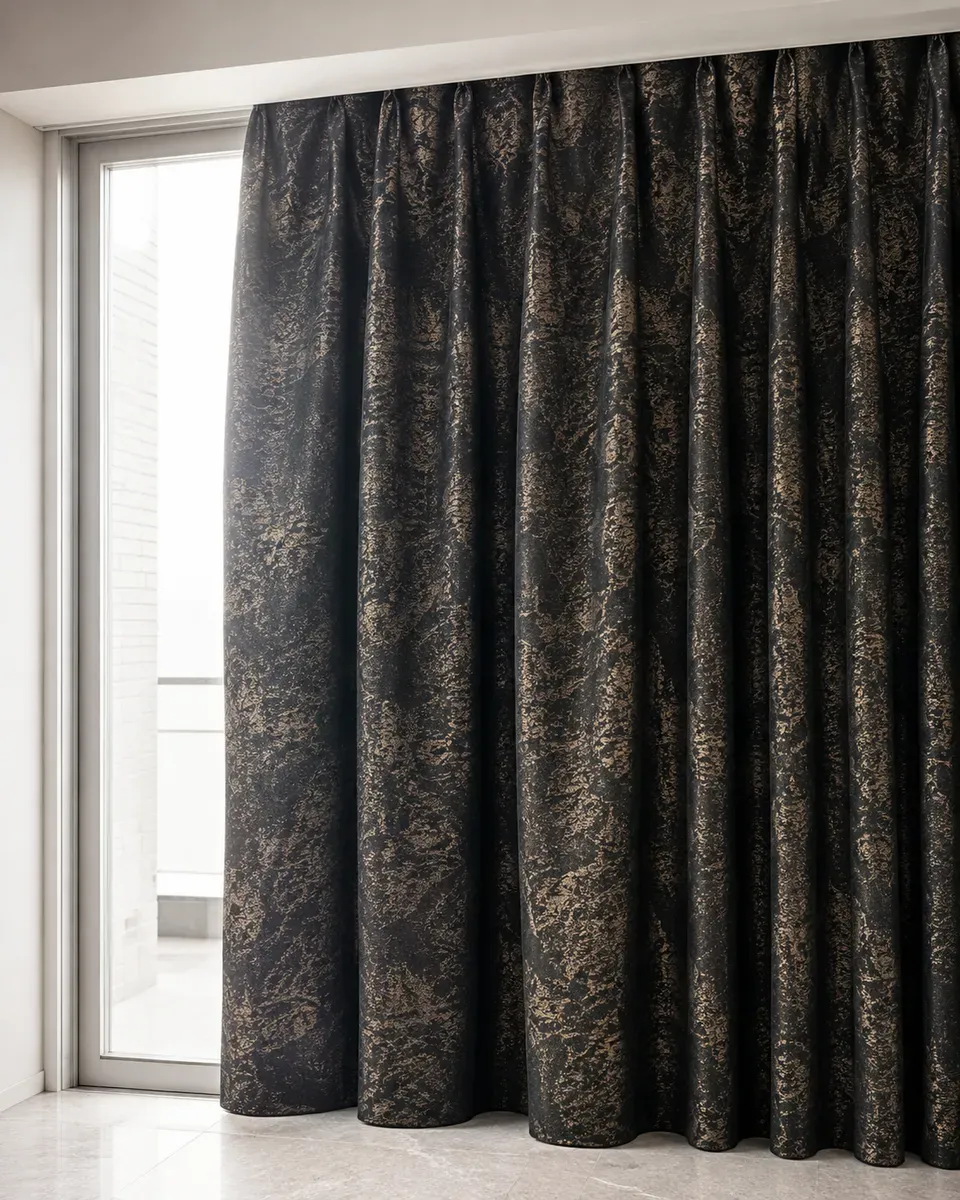
Why Made-to-Order Curtains Are Beautiful
Why a hotel window looks so good is not the luxury of the fabric. It is the dimensions, the depth of the pleats and the weight of the hem. The reasons lie in what can be measured.
Read the next article→It is quicker to decide
the combination with a professional.
Tell us about your layout, sunlight and the furniture you plan to place. Once we hear the conditions, we will propose floor, wallpaper and curtains as one space. You can also check samples at home.
Contact us→Consultation and estimates are free.